Carol Prost Artist

“Homeless Boy Lives Here,” outdoor installation
Since 1983 I have worked both worked directly as a counselor, case and shelter manager, and educator, with individuals and families who were experiencing homelessness and also as a research evaluator and trainer with social service agency programs serving, educating, and conducting out-reach, with such individuals and/or families. Through this experience I have heard many first-hand accounts and witnessed the multiple and long terms effects of homelessness. Not only is this experience a cross-cultural and socio-economic phenomenon, but also more pervasive and damaging than commonly thought. Through the art installation, “Homeless Boy Lives Here,” I wanted to create a visual symbol that would portray both the reality of homelessness and its insidious presence in our society. Deliberately using a physical structure that had been widely seen in a previous campus outdoor exhibit, I hoped to call forth, at least for those who recognized this structure, the unconscious comfort of the familiar, yet throw this comfort off balance as the form is transformed into another image. I also chose this structure because its bright primary colors imbued a childlike sense of play. The tension between what should be the lightness and joy of childhood; the comfort of a play-structure was distorted into the deprivation of a make-shift shelter for a homeless boy.
Illustrating that homelessness is not just for one night, rather a continuous situation, a build-up of scattered trash was secured into the ground at the shelter’s entrance. Choosing items readily associated with children, ice cream and chocolate milk, I further escalated the tension by selecting well known brands associated with two very different business philosophies and social policies. Believing as Jochen Gerze, the German counter-memorial constructionist had said that, “Art can only give the challenge back to the people.” (Lupu), I illustrated the choices we, as consumers, can make to the support polices that we wish to further; as exemplified in Nestlé’s brand, chosen for the chocolate milk containers, representing the potential of destruction and greed perpetrated by this large corporation, well known for its resale of unfit and recalled baby formula to third world consumers; contrasted with Ben and Jerry’s brand, selected for the ice cream containers, representing a successful business implementing socially conscious employment practices, such as its policy to “Earmarked 7.5% of all pre-tax profits for donation to not-for-profit organizations which facilitate progressive social change by addressing the underlying conditions of societal and environmental problems. Decisions on how to distribute the money via the Ben & Jerry's Foundation are made by a team of employees that meets to review proposals.” (Ben and Jerry). I further selected the ice cream flavors represented by musical bands, “Cherry Garcia” and “Dave Matthews Band,” to emphasize the concept of music and song and its association with play and childhood.
Old and worn, green, plastic, shower curtains were duct taped to the roof and draped across the open back of the metal structure to create a curtain and remind one of the shedding of water and the complexities that the homeless must cope with such as, changing and inclement weather, and the challenge to wash and keep clean. Extensive use of duct-tape, randomly distributed on the structure, symbolized the fragility of trying to hold life together and the vulnerability experienced in homelessness.
The child was constructed of a wire armature made for the body and legs, clothed in a beige work-shirt and denim jeans, with wired in cowboy boots. A large pokey-man doll; a further attempt at humor and a familiar icon used in an unfamiliar manner; was selected for the head and chest. A cement-cast, made of my forearm and hand, was wired into the shirt, and the sleeve of the other deliberately missing arm, symbolizing the displacement and impotency of being homeless, was pinned onto the front of the shirt. The child was further accompanied by a dog -an aged stuffed animal; for we all seek companionship, even the homeless. Child and dog lay together upon a colorful, but old, granny-crocheted pillow and a worn, green, army, blanket. An extra pair of blue, tattered, socks, draped outside the one window, implied a sense of home and semi-permanence.
Initially the sculpture of the ‘child’ of this installation was garbed in a camouflage shirt, intended as a reference to “the war on poverty.” However, while I was constructing the installation, many individuals passing by either asked or voiced a belief that this structure was about the war in Iraq or a military piece. Since this detracted from my core focus of the pervasiveness of homelessness, including experienced by children in the USA and even locally in Waltham, I changed the shirt to a neutral one. With the military reference removed, the figure was then seen to be a boy or child, and the concern shifted; as one observer then asked, “Is this about abuse?”
I scrawled graffiti on the outside structure declaring, “Homeless boy lives here,” and periodically visited to observe and note audience responses. Even prior to the installation’s completion students climbed inside with the boy, sat and talked, or snacked. Approximately a week after the installation’s completion, the boy, minus his boots, was stolen from the structure.
It is curious to me that his boots remained. As Freedberg in The Power of Images discusses regarding multiple attacks on works of art, that when looked at closely the attacks do not appear random, rather they are deliberate and considered. For example, a man attacking Rembrandt’s “The Nightwatch” in 1911 “because (he says) he is disaffected with the state (he has been laid off from his job as a cook in the navy) (Freedberg: 407). Freedberg further suggests that attacks on images may be done to gain a perceived notoriety. Was this structure attracting too much interest and community gathering for someone’s liking? Did their theft of the boy intend to change the focus and garner attention toward them, rather than the installation?
Upset that I had not yet photographed the installation, I made the decision to incorporate the theft into the process and added graffiti stating, “Homeless boy has been kidnapped. Please return.” After his disappearance, I no longer observed students sitting in the structure and, at least for me, there was a sense of emptiness and abandonment. After a day or so of no response, I added the plea, “Please return, so I may photograph for my class portfolio.” The boy was never returned.
I do not know what impact this installation had on its audience at large, however the inter-actions with the structure, and my encounters during construction, and on subsequent visits, was that it attracted and involved passers-by. Students, faculty, and other observers, were inquisitive, reflective, and questioning, as to the meaning and the story that was being portrayed. Perhaps some thinking on the nature of homelessness and the question, as to where do those without a home reside, was generated.
Similarly to Lior, I did not want to put up text describing what the art piece was to engender, rather I hoped to stimulate a response, dialogue, and perhaps generate new perceptions about the concept of homelessness. I had contemplated posting a small sign, including the exhibit title and some statistics on homelessness. While for me this detracts from the visceral and purely experiential stimulus of art, it may have, as discussed for “Voices of Palestine,” provided a more cohesive context and in so doing, furthered my goal of awakening awareness, understanding, and compassion for those who experience homelessness. The piece was successful in generating conversation and inquisitiveness to its meaning and representation, as one student told me, “I know it must be about some social issue, if it is on this campus.”
Beasties of the Heart
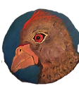
My Beastie Series was inspired by the work of American sculptor, illustrator, wood-engraver, and printmaker Leonard Baskin whose favorite trope was said to be the bird-human hybrid and the melding of archetypical contradictions. Baskin, profoundly affected by the horrors of the Nazi holocaust and the plight of the marginalized and oppressed, described art as man’s distinctly human way of fighting death and as an act of denial of death.
The process of creating the Beasties was also influenced by Wunderkammer and the magical relationships that can arise among disparate objects.
The Wunderkammer, originally a room, brought together the unusual natural and historical relics (sometimes faked), even P.T.Barnum, into a disparate collection intended to inspire wonder that reflected the aesthetics of the time and culture in which they sat. was inspired by the Wunderkammer, or Cabinets of Curiosities, which intended to create magical relationships from collections of disparate objects and
I seek to draw out the beast within us as well as the sentience within all beasts.
Things are not always what they seem. At times we see what we remember, rather than what is in front of us.
At times we observe what we desire, or fear, rather than what is present. We all have beasts inside of us; happy beasts, angry beasts, sad beasts, powerful beasts, frightened beasts, loving beasts, and more.
In times that assault our humanness, personally, environmentally or politically, we can become even more inter-related. Clan and ‘other’ converge, a spark of divinity ignites us all, melding archetypal contradictions with whimsy.